Have you noticed lately that CNBC is doing some funny things when it comes to their earnings charts? If you have paid close attention to what they show it is really spooky.
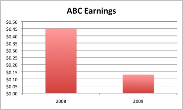
Here is what I mean. Usually, when I read a chart, I look from left to right and expect that I am seeing the date/data from earliest (left) to most recent (right). Old-Left, New-Right.
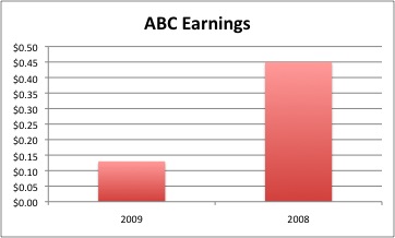
But something was bugging me when I peered up every so often at CNBC and saw that earnings and revenues for companies being reported on where looking as if they were handily beating previous periods – for the the quarter and/or the year.
I could not find a video that represents this even though I looked through several. I wonder if they may not want this to become historical record? But, below is how it looks like on CNBC.
First is the chart of how I would envision and earnings comparison to appear:
Now, this is how it appears on CNBC (sans the glitz and sound effects):
Is it me?
Perhaps this is why we are seeing a crash in CNBC’s ratings when they really should be rising. The economy is front and center, right?
The fact is that they have no real competition except if you include podcasts like The Disciplined Investor (iTunes click HERE) and blogs that tell the story as it really is.
Click HERE for a great story on CNBC’s dwindling viewership and their Nielson Ratings…
Thoughts???????


